The Sensemakers
Enhancing KPI Reporting with Data Integration and Glossaries
The ability to effectively design and communicate key performance indicators (KPIs) is crucial for informed decision-making in modern business. Recently on The Sensemakers, Robert Rouse concluded his three-part series on “The Design of Everyday KPIs.” These highly-recommended videos offer invaluable insights into how organizations can streamline their KPI management, improve reporting accuracy, and break through data silos using the thoughtful integration of data structures and glossaries.
Here are some of the key takeaways from each episode and how these practices can revolutionize your KPI management.
Episode 1: Building KPI Dashboards That Work
In the first episode, Robert focuses on the essential building blocks of KPI dashboards. He, along with fellow Sensemakers, Keith Helfrich and Jonathan Drummey, discuss the fundamentals of designing dashboards that are not only visually appealing, but also informative and efficient. Highlights:
KPI Visualization Fundamentals: Clear and concise visualization is vital. Dashboards should show total values, comparison metrics (year-over-year), and metadata like labels and definitions to provide context.
Practical Application of KPIs: Examples such as the use of “Big Aggregate Numbers” (BANs) demonstrate how to create effective executive summaries with top-line totals that are easy to interpret.
Data Modeling for Flexibility: A key takeaway is the importance of separating numeric values, prefixes, and suffixes in dashboards, allowing greater flexibility and efficiency when updating or managing data within tools like Tableau.
This episode offers a comprehensive look at how to make KPIs more accessible and understandable for decision-makers, from executives to operational staff.
Episode 2: The Power of KPI Glossaries
The second episode, “KPI Glossaries,” shifts focus to the importance of defining KPIs and integrating those definitions across an organization. The discussion covers how KPI glossaries can ensure that all business units speak the same “data language,” reducing confusion and inconsistency.
Clear Definitions are Key: Different departments often define and measure KPIs differently. A unified KPI glossary standardizes these definitions across the organization, reducing errors.
Integrating Glossaries with Reports: A key insight is the need to dynamically link KPI definitions and descriptions directly into reports and dashboards. This allows for seamless updates across platforms, ensuring that everyone has access to the most up-to-date metrics.
Centralized Management: Using numeric IDs for KPIs ensures better performance in reporting tools and enables organizations to quickly adapt and update KPI definitions without extensive manual intervention.
By integrating KPI glossaries into reporting tools, organizations can create a consistent and clear reference point for all teams, helping to avoid confusion and inefficiency.
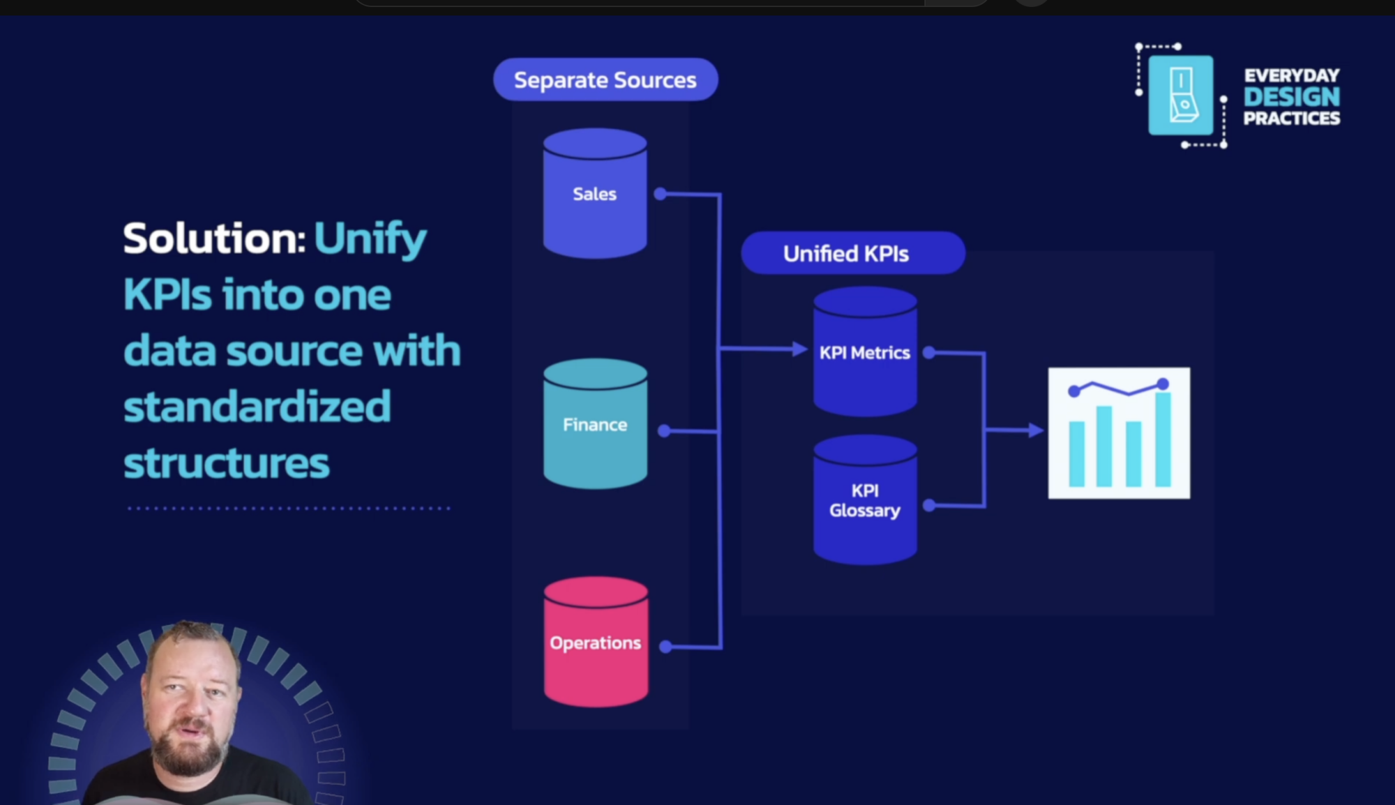
Episode 3: Merging Data Silos
The final episode, “Merging Data Silos with a KPI Layer,” tackles one of the biggest challenges in enterprise reporting — integrating data from disparate sources and merging it into a cohesive KPI layer. Large organizations often struggle with fragmented data systems, making it difficult to get a holistic view of business performance. This episode explores:
Unifying Data Silos: Robert explains how to merge data silos by restructuring KPI data. By stacking KPIs in rows instead of columns, organizations can easily integrate metrics from different departments, such as sales, finance, and operations, into a single dataset.
Advanced Data Aggregation: Using techniques like GROUP BY ROLLUP in tools like Snowflake, businesses can avoid issues like double-counting and ensure that regional and global totals are accurate.
Time-Sensitive KPIs: Special attention is given to managing time-based KPIs, ensuring that comparisons between periods (e.g., year-to-date) are accurate, without overwhelming the reporting system with complex calculations.
With the right data structure in place, organizations can unify their reporting and create a “single source of truth” for KPIs across all business units.
Creating a Data-Driven Culture
The three videos collectively highlight the importance of thoughtful KPI management. From the basics of dashboard design and KPI visualization to the integration of KPI glossaries and the unification of data silos, the series provides an extremely useful roadmap for organizations looking to take their data reporting to the next level.
By implementing the strategies discussed in this series, businesses can:
Improve Decision-Making: With clear, consistent, and accessible KPIs, executives and teams can make faster, better-informed decisions.
Streamline Reporting: Integrating KPI glossaries and unifying data silos significantly reduces the manual effort involved in maintaining reports and dashboards.
Future-Proof Reporting Systems: With scalable data structures in place, organizations can adapt to changes in metrics, business models, or technology without overhauling their reporting systems.
In an era where data-driven decision-making is more important than ever, taking steps likes these can ensure that your organization stays ahead of the curve.