Newsletters
Elements of a Well-Designed Dashboard
Analytics Advantage is a weekly newsletter of actionable insights, proven strategies, and top tips for getting the most from your data and making high-stakes decisions with confidence. Here’s a recent sample. We hope you’ll subscribe.
***
Why Design Matters
Our world is one of chaos and uncertainty, so good design is vitally important. This includes the dashboards you create.
Design matters because our brains need order to focus on the content, not the form. Too often, I’ve wasted time trying to wade through a poorly-designed product to get the answers I need.
You know good design when you see it. The answers or next steps just seem to flow. You also know bad design. Have you ever filled out a form only to get errors saying “Tsk-tsk, you didn’t complete this essential field.”
Good design can even save lives! A couple of years ago, the Hawaii Emergency Notification System ran a test of their system. The tester sent out this message:

Unbeknownst to the tester, they had accidentally sent the message through the real Emergency Alert System.
After the dust settled, an image of the testing system was made public:

It’s only after I’ve looked at this image multiple times that I can find the test vs. production options. Imagine if this had been something more serious.
Visual Hierarchy
Visual hierarchy is an ordering of elements where some are emphasized over others.
The hierarchy of elements helps you quickly determine what’s important and what’s not. Preattentive attributes are one of the ways designers implement a hierarchy. By increasing the size of the KPIs on a dashboard, they consume more of the real estate on the dashboard, appear closer, and command more of our attention. These elements help set the context for the entire story the dashboard is telling. If sales are down, your interest is going to focus on what’s causing the decline. A well-designed dashboard will provide the answers to this question or links to the answer.
An easy way that I can “feel” the lack of a visual hierarchy is when my eye jumps around the dashboard. I find it wandering from place to place, not feeling confident about what is most important.
Visual Thread
This element of a well-designed dashboard can’t really be measured, which always makes data people uncomfortable. Having a visual thread is when the second and sometimes third questions can be answered in a dashboard or series of dashboard.
The answers just seem to “flow” and feel intuitive. When these elements are present, you can follow multiple paths within the same dashboard.
For example, if sales are down, what are the regions where sales dropped compared to last month? You’ll see that sales are down in the east and want to know what products drove the decrease. Once you see that sales of tables in the east region were down significantly compared to last month, you have a concise action item. Call Gerry in Texas and ask him why his table sales dropped so dramatically.
Color
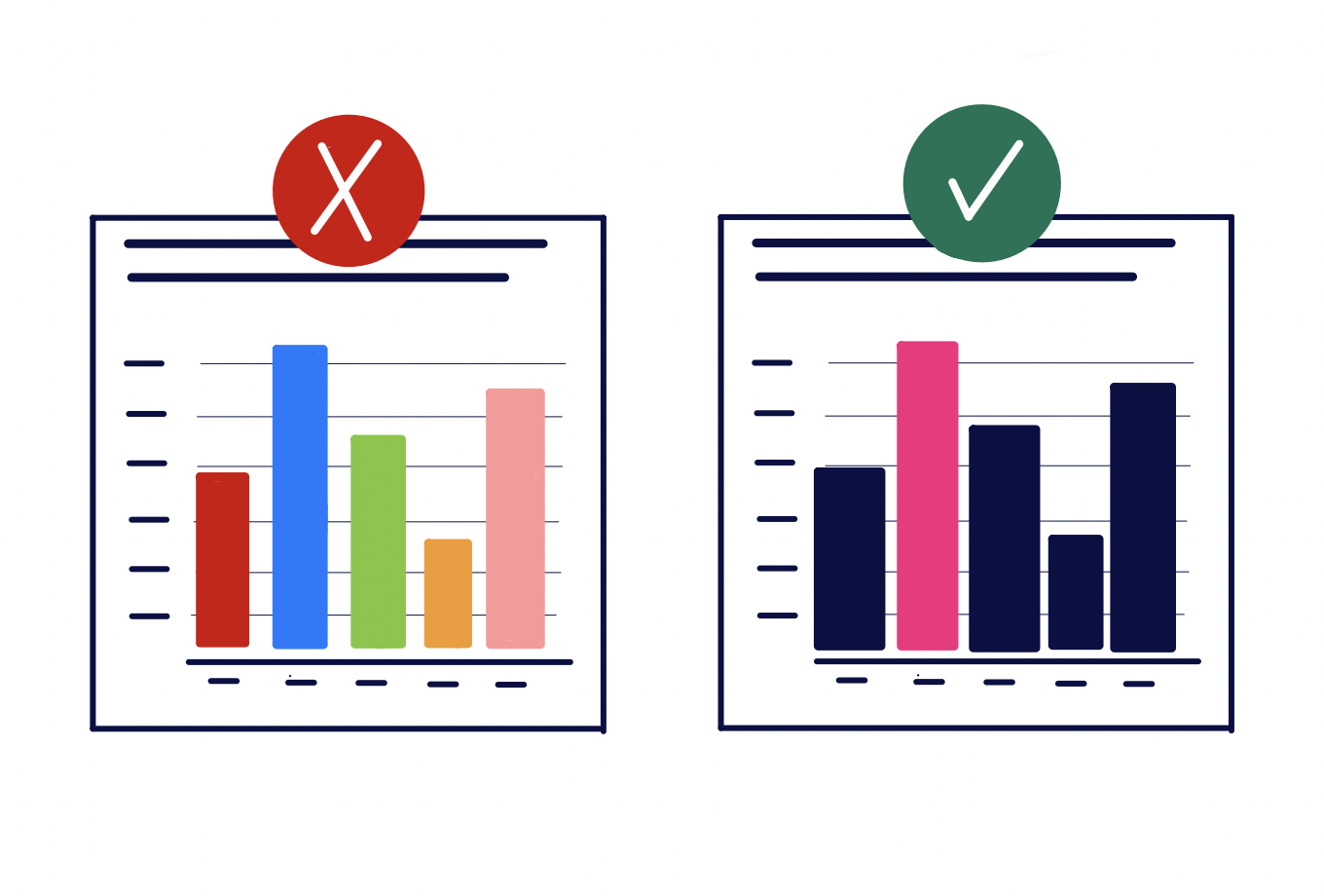
Color is one of the strongest attention grabbers in design. A sea of color can communicate vitality, life, but it can also convey confusion. The eye doesn’t know where to look. All the colors can compete for your attention.
A single color in a field of white or gray will grab your attention. Whether it’s an increase or decrease in a key metric or measure, color focuses the user’s attention. It’s hard to avoid what the designer wants you to see.
Design to a Grid
Order is one of the elements that helps the mind focus on the content over the form of a product. Most dashboards are designed for use in business and using a grid is the best option to design effectively.
There’s a time and place for a more eccentric pattern to communicating your story, but a business dashboard typically isn’t it.
Designing elements to fit a grid looks like lining up your elements to a top left corner alignment. Creating visual gutters where there is no content gives your eye a place to rest when it’s not looking at data.
Details Really Do Matter
People will often go back to the 80/20 principle. 80% is good enough. But the difference between “good enough” and “well-designed” is often in the details. Whether it’s tooltips designed beyond their default, or thoughtful links which keep users in the flow, it communicates the depth of thought you put into your product.
When I’m asked to review a dashboard, these are some of the first elements I dig into. It communicates whether the designer just wanted to “get it done” or to create a holistic user experience. It communicates respect for my time.
Minimalism Isn’t Always the Answer
Minimalism has been all the rage for years now. But it can get taken too far. I’ve seen dashboards where I have to click and hover just to understand what the numbers represent. Maybe it’s because I’m an old millennial, but making everything beige or white is just…boring.
Everything in white, having to expand every menu just to understand the context – it drives me crazy. Just like a lack of attention to detail, it communicates a lack of respect for my time.
I’m guilty of not including enough context, too. It’s easy to spend so much time on a dashboard, living with the data, that you forget how your audience needs to be brought along for the story.
Shaun Davis, your personal data therapist, understands your unique challenges and helps you navigate through the data maze. With keen insight, he discerns the signal from the noise, tenaciously finding the right solutions to guide you through the ever-growing data landscape. Shaun has partnered for 10 years with top data teams to turn their data into profitable and efficiency hunting action. Learn more about Shaun.


