Action Bits
Creating Inline Bar Charts in Tableau

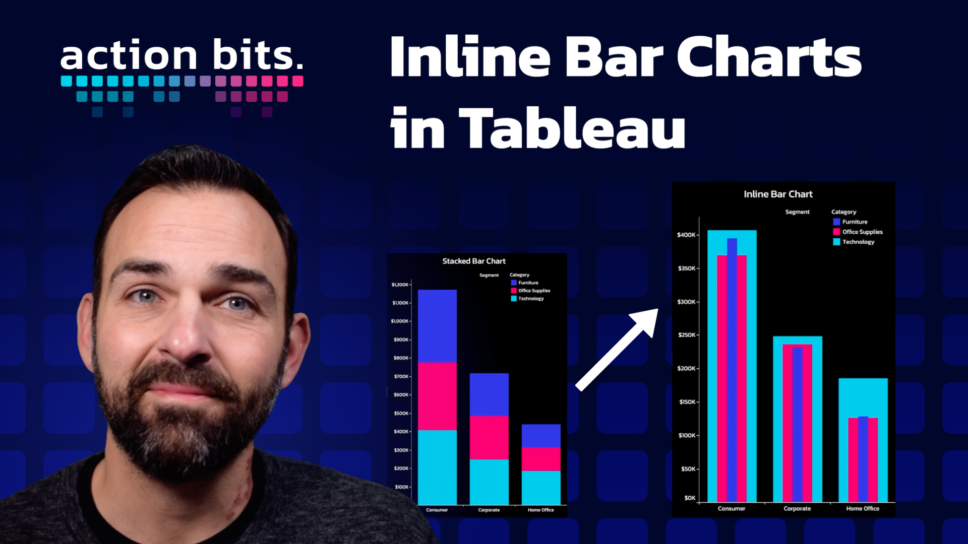
Inline bar charts are a powerful tool in data viz, offering a clear and concise way to compare categories directly. Tableau makes the creation of inline bar charts straightforward. This quick guide will walk you through the process using Tableau’s sample Superstore data, transforming a standard stacked bar chart into an inline bar chart in just a few simple steps.
Step 1: Setting Up Your Data
Start by opening Tableau and loading the sample Superstore dataset. This dataset is included with Tableau and provides a rich source of sales data to work with.
Step 2: Creating a Stacked Bar Chart
1. Drag the ‘Segment’ field to the Columns shelf. This determines the segmentation of data along the x-axis.
2. Next, drag the ‘Sales’ field to the Rows shelf. This step plots the sales data, providing a quantitative measure for your chart.
3. To add depth to your visualization, drag the ‘Category’ field to the Color mark. This action assigns different colors to each category, enhancing the visual distinction between data segments.
At this point, you’ll have a colorful stacked bar chart, with each segment’s sales data piled on top of one another.
Step 3: Transitioning to an Inline Bar Chart
1. Navigate to the ‘Analysis’ menu, and locate the ‘Stack Marks’ option. Uncheck this option to disable stacking, which will spread out the data segments horizontally instead of stacking them vertically.
2. Finally, drag the ‘Category’ field from the Color mark to the Size mark. This adjustment changes how categories are represented, using width variations instead of color to differentiate between them.
And that’s it! You’ve transformed your stacked bar chart into an inline bar chart!
Inline bar charts are an excellent choice for when you need to compare individual data points within the same category directly. By following these simple steps in Tableau, you can enhance your data storytelling, providing clearer insights and a more intuitive understanding of your data.
Remember, the key to effective data visualization is not just in choosing the right chart type, but in understanding what your data is trying to tell you.