Thought Leadership
“Don’t Make Me Think,” “Don’t Make Me Click,” & Other Everyday Design Principles in Tableau
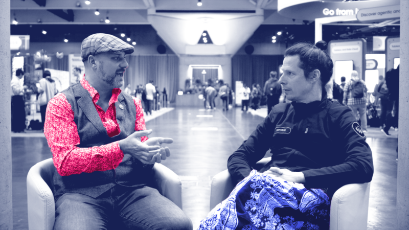
In this episode of Action’s The Sensemaker’s Video Podcast, Robert Rouse and Keith Helfrich continue exploring everyday design practices in Tableau. This time, they look at weight and alignment in bar chart design.
Robert explains why the design principles of “Don’t Make Me Think” and “Don’t Make Me Click” should be considered when designing dashboards. And, Keith waxes poetic on flow states, data feng shui, and the innate trust conveyed in better organized data.
They also cover designing more intuitive dashboards, aligning labels and numerical values for data presentation, the importance of visual weight, and other aesthetic and organizational considerations for more effective data visualization.


