
The Sensemakers
Everyday Design Practices: How Small Choices Create Big Impact in Dashboards
In data visualization, small design choices can make a big difference. From affordance and propositional density to alignment and visual weight, every aspect of dashboard design influences how users interact with the data presented. Drawing insights from Robert Rouse’s “Everyday Design Practices” series on The Sensemakers, here are three fundamental principles for enhancing usability, improved comprehension, and creating a seamless experience for users.
1. Affordance: Making Actions Intuitive
Affordance refers to how an object suggests its use. In everyday design, a well-designed door, for instance, should clearly indicate whether to push or pull it. Similarly, dashboards should guide users intuitively, making interactive elements unmistakable.
Key Takeaways:
Visual Cues Matter: Just as blue underlined text in a browser is commonly understood to indicate a hyperlink, dashboards should use similar and consistent design cues to highlight interactive elements.
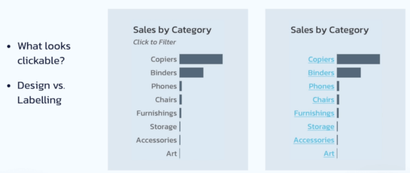
Minimize Cognitive Load: If a chart is meant to be interactive, users shouldn’t need instructions to realize that. Good design makes it obvious.
Real-World Application: In dashboard design, using familiar interface elements (such as buttons or hover-over effects) improves usability and reduces frustration.
2. Propositional Density: Maximizing Information in Minimal Space
Propositional density describes the efficiency of communication through design. In bar charts, the bars themselves encode numerical values, but their position and color can add extra meaning, making them more informative and meaningful without clutter.
Key Takeaways:
Sorting Enhances Meaning: Ordering bars by value rather than alphabetically adds a second layer of encoding–value and rank—making comparisons easier.
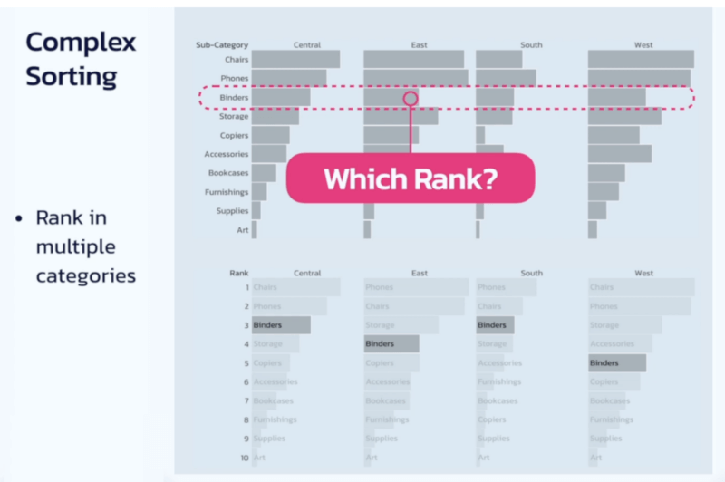
Color and Positioning Add Layers: A single visual element can convey multiple types of information (e.g., height for value, color for category, position for rank).
Design with Intent: The best dashboards leverage space efficiently while maintaining clarity and usability.
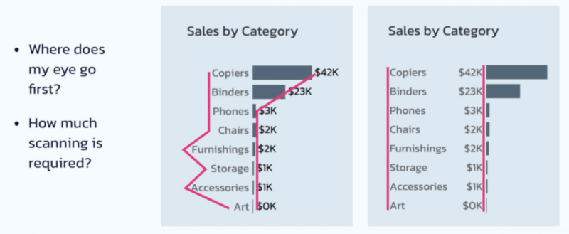
3. Weight & Alignment: Structuring Visual Hierarchy
A well-organized layout guides the user’s eye naturally, reducing effort and increasing comprehension. Proper alignment, enclosure, and weight-distribution help users scan and absorb information without unnecessary friction.
Key Takeaways:
Left-Align Labels, Right-Align Numbers: This approach improves readability and makes scanning for key data points faster and easier.
Visual Weight Directs Attention: Bold colors and large elements draw focus–use them intentionally to highlight important insights.
Psychological Impact: A structured, visually-appealing dashboard fosters confidence and ease of use, while clutter and misalignment create stress and confusion.
Bringing It All Together: The Art of Thoughtful Design
By applying these principles, dashboards can be created that are both functional and intuitive. Great design isn’t just about aesthetics; it’s also about removing friction, enhancing clarity, and making data more accessible.
Want to level up your dashboard designs? Implement these everyday design practices and transform your user experience.