Newsletters
I’m Tired of Explaining Dashboards
Analytics Advantage is a weekly newsletter of actionable insights, proven strategies, and top tips for getting the most from your data and making high-stakes decisions with confidence. Here’s a recent sample. We hope you’ll subscribe.
***
The Art of Refinement
Good design is a process of refinement and simplification.
Take SpaceX’s Raptor engine design. It progressed from complexity to simplicity over time.

Or, consider Picasso’s “The Bull,” where he reduced a bull to its essence, capturing its power with just a few lines.
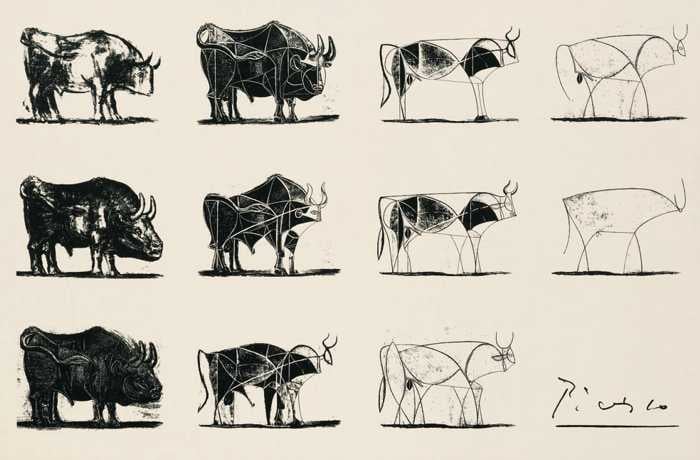
In commentary on “The Bull,” Dan Scott writes:
“Learning how to take complex subjects and simplify them down to abstract forms is a major aspect of art. Most people think that art is all about seeing more detail, but it is really about seeing less. Seeing basic patterns amongst the ‘noise;’ seeing basic forms amongst the complex; seeing the few important details which convey the majority of meaning.”
Now, I’m not suggesting that you turn your dashboard into abstract art. But the best dashboards follow this same principle: they simplify the complex to make functionality and insights effortless.
Signs Your Dashboard Isn’t Clear
There are some key signs your dashboard isn’t clear:
- Requests for training sessions on how to use your dashboard
- Documentation on functionality rather than on the data itself
- Long explanations required for how features work
- Watching users struggle to find what you thought was obvious
Feedback like this is hard to hear, but it’s worse to create a product no one uses—or understands.
Think of the BlackBerry vs. the iPhone: The BlackBerry was shipped with a User’s Guide that rivaled that of your car, while the first iPhone guide was a single sheet of paper.

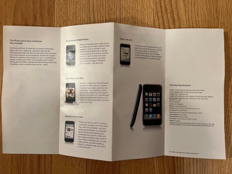
Most of us are shipping BlackBerrys.
The Core Elements of a Good Design
I’ve had to learn this lesson for what feels like my entire life. I tell an interesting (OK, interesting to me) story, but I make the mistake of leaving out essential context that brings my audience along for the journey.
The same is true for any data product you create. It has to stand on its own. No training sessions. No user’s guide.
Anyone in your audience should be able to look at it and quickly come away with the data story. Anything less is wasting their time.
So, what are the key elements to good design?
Simple, Yet Dense Designs
A friend recently shared an intriguing website with me: 1 Dataset, 100 Visualizations. It features just 6 numbers arranged into a simple 2×3 matrix—and yet, there are 100 different ways of visualizing those 6 data points.
It’s interesting, but many designs are cluttered, such as this example:
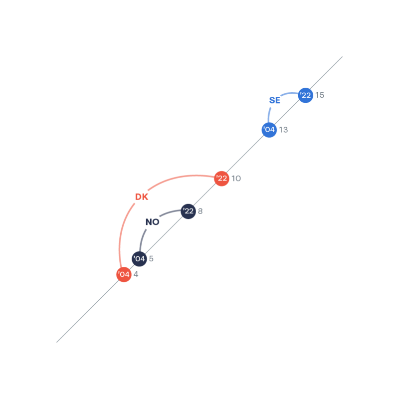
Yet, that’s the point. The website shows you the breadth of methods, so the visualizations that are simple, dense, and clear stand out. Like this example:
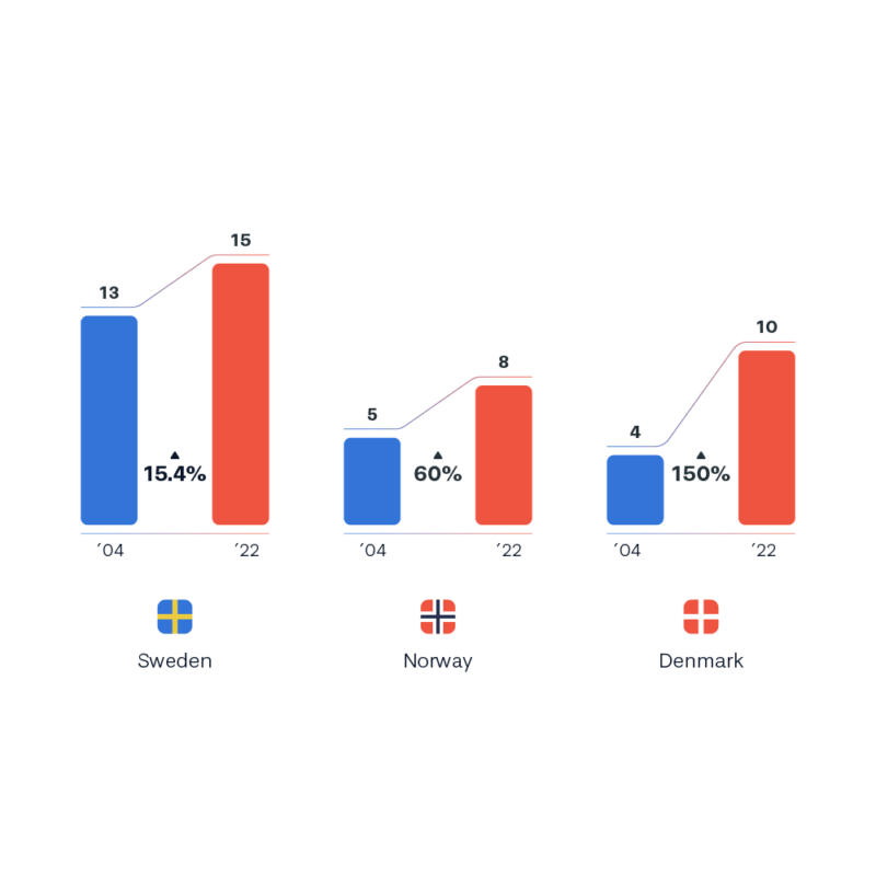
There are no shortcuts to quality design. It takes time, brutally honest feedback, and deep work. Without it, there will always be a gap or failure to communicate.
On-Product Context
Don’t hide explanations in tooltips or expandable menus. If someone exports your dashboard, the context disappears.
Your story needs to leap off the page.
The bar graph from earlier is incomplete without this title: Number of World Heritage Sites by Country
Instantly, the story becomes clear. Context should be embedded directly into the visual.
A Story Worth Telling
Is the story your team is telling actually worth telling?
Avoid the “So what?” trap. Many dashboards present data that’s accurate, but meaningless without context. Ask yourself: “Why does this information matter?”
Customers often request simple charts—“sales by quarter,” for example. But there’s deeper value if you dig. Tools like The Five Whys or Design Thinking can help uncover what your audience actually needs. And it’s not just a faster horse.
Not every story is worth telling, but the best ones change how your audience thinks and acts.
The Best Fix for Bad Design? Feedback
Watch your audience interact with the product. Ask them to answer a simple question: “What product lost the most money last quarter?”
But here’s the catch: your team can’t say anything. Just watch.
It will likely go like this: Devs watching QA test the product.
Focus frustration on the design, not the user. A better design is always possible—it just takes work and refinement.
Closing Thoughts
Great design takes time and serious thought. There are no shortcuts.
Encourage your team to put in the dedicated work of creating amazing products. This will only come through refinement, simplification, and the dialogical learning process.
But, everyone wins in the end. The audience gets a better product. Your team grows. The company learns more.
Happy refining!
Shaun Davis, your personal data therapist, understands your unique challenges and helps you navigate through the data maze. With keen insight, he discerns the signal from the noise, tenaciously finding the right solutions to guide you through the ever-growing data landscape. Shaun has partnered for 10 years with top data teams to turn their data into profitable and efficiency hunting action. Learn more about Shaun.


