Newsletters
Why Dashboards?
Analytics Advantage is a weekly newsletter of actionable insights, proven strategies, and top tips for getting the most from your data and making high-stakes decisions with confidence. Here’s a recent sample. We hope you’ll subscribe.
***
What is a Dashboard?
First, let’s define our term.
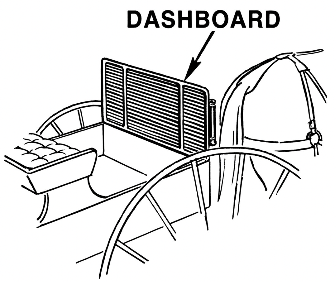
The word “dashboard” refers to a protective barrier that keeps mud from being “dashed” up onto riders in horse-drawn carts. Uh….okay.
So when did it get co-opted into a synonym for a way to understand numerous data points at once? The intention of the vehicle dashboard is to serve as the central control panel, since this is where all the information about the car gets displayed.
Horse-drawn carriage protector -> Information display for a vehicle -> Information display for data.
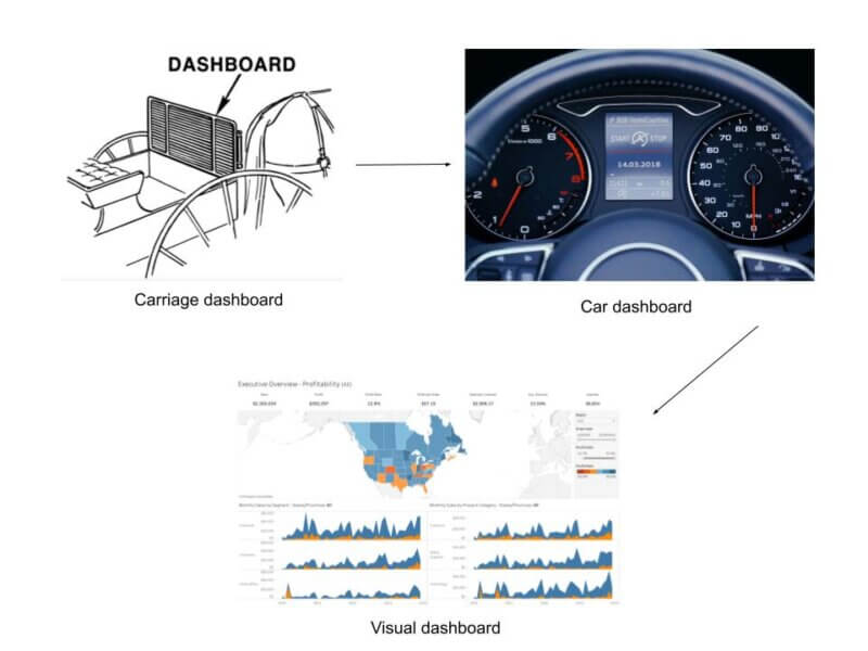
Thrilling.
In the modern sense, a dashboard is a way to bring together multiple data points into a single data-driven story.
The modern dashboard relies on a combination of individual data points and visual analytics to tell a story around data. Dashboards can be static, but are most often interactive and dynamic. They should respond to user input and update as the underlying data changes.
Dashboards Tell a Thousand Insights
The human brain is a pattern-searching machine. We look for patterns to weave ourselves into a broader story around our role. Our brain can process images at around 13 milliseconds. For context, there are 1,000 milliseconds in a second. I apologize in advance for the technical jargon but that’s freaky fast!
If this same information is shown as a table of numbers or a narrative, it has to go through a different pathway and takes much longer to process.
If I mention the color blue and insurance, what brand comes to mind?
If I mention the color red and insurance, what brand comes to mind?
Immediately thinking of Allstate, State Farm, is the power of our visual processing.
P.S. Isn’t it weird that you’re thinking about Green and GEICO?
Now seeing the power of visual analytics, why would you expect your customers to comprehend a table of numbers with some highlighting?
Realistic Alternatives
There are alternatives to dashboards and visualizations, but they aren’t great.
Giving your customers an Excel workbook is like giving a gift card as a present; it’s just a chore. They will use the data, filter, add some calculations, and then make a chart. Isn’t this what a dashboard does?
We’re currently in peak hype mode for AI. But it’s still not ready for prime time. There are too many unknowns, too many glaring mistakes, for companies to fully trust it for deep analysis. It’s great for data extraction and summarization, but it struggles with making novel connections that are so easy for our brains.
The last alternative is some other form of narrative or summarization. Whether this is a PDF or an infographic, their drawbacks are that they aren’t automated. Once it’s created, the clock starts ticking for when the analysis needs to be done again. These types of media have their place, but it’s more niche than broadly applicable.
Getting the Most from Your Design
The “aha” moment for me in learning visual analytics was The Big Book of Dashboards and its heavy emphasis on preattentive attributes.
I’ll let one of the OG’s of data analysis, John Tukey, define them for you:
“Visual aspects that the human brain can process almost immediately, without conscious thought”
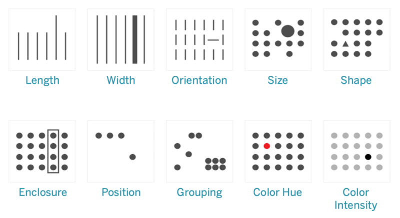
Preattentive attributes are immediately recognizable patterns which our brains seek out in images. They’re the reason why traffic lights are red and the STOP indicator is always on the top or left-most position. Using preattentive attributes, you can tell a wide range of stories, helping your customers to see what you know deeply from the data.
When Not to Use a Dashboard?
I don’t have a strong answer. There are times where the effort just isn’t worth it, but those are niche cases. Even having a table and a couple of charts linked together can dramatically increase what you see from the data.
Get out there and start building!
Shaun Davis, your personal data therapist, understands your unique challenges and helps you navigate through the data maze. With keen insight, he discerns the signal from the noise, tenaciously finding the right solutions to guide you through the ever-growing data landscape. Shaun has partnered for 10 years with top data teams to turn their data into profitable and efficiency hunting action. Learn more about Shaun.


