Articles
Wowing Stakeholders with Trellis Charts

Elevating Analytics with Trellis Charts: Transforming Complexity into Clarity
In the dynamic field of data analytics, our primary objective is to distill complex datasets into compelling and actionable insights. This crucial process not only improves decision-making capabilities but also underscores the invaluable role of data analysts. This blog post delves into the significant impact that Trellis charts can have in realizing this ambition, spotlighting a case study that exemplifies enhanced stakeholder engagement and improved data interpretation for a client.
The Challenge: Overwhelming Data, Underwhelming Insights
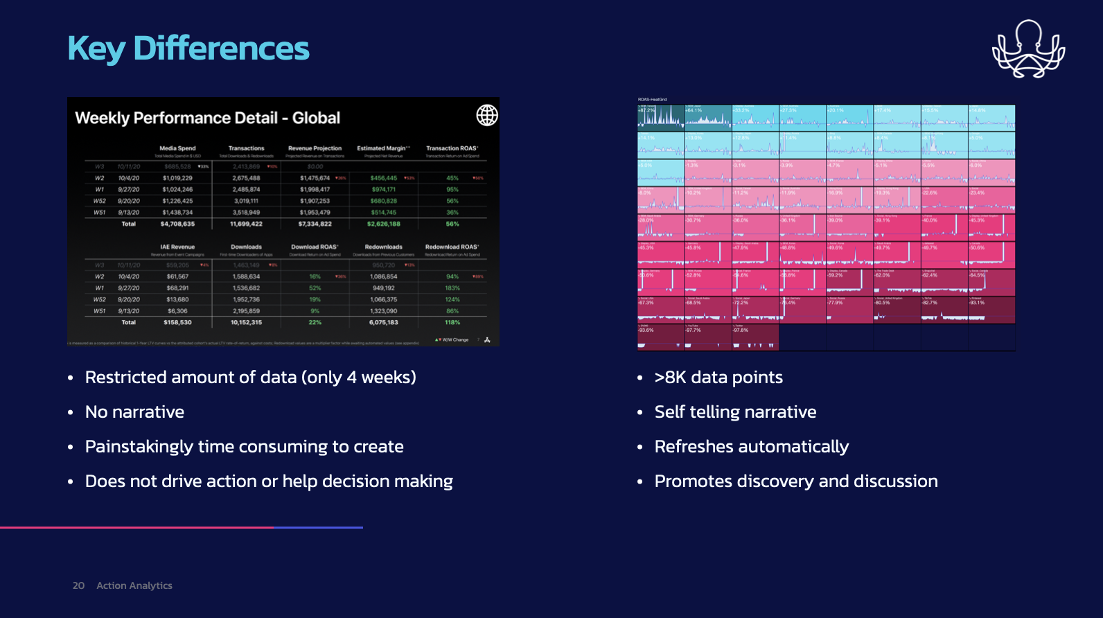
Faced with an overwhelming influx of data from a diverse array of marketing channels, our client, a global entity operating in over 100 countries, encountered significant hurdles. Their advertising programs generated an immense volume of data points, scattered across multiple databases. The labor-intensive task of compiling a comprehensive weekly performance report was time-consuming and predominantly manual. This situation resulted in analysts dedicating excessive hours to data consolidation, leaving minimal time for actual analysis or strategic development. The consequence was a twofold predicament: analysts experienced frustration and reduced job satisfaction, while executives grappled with interpreting the data, which often lacked contextual clarity, trend analysis, and actionable insights.
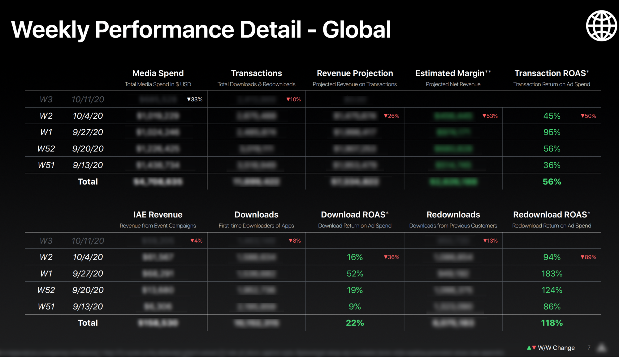
Implementing the Solution: The Efficacy of Trellis Charts
Our strategy to overcome these challenges involved the introduction of an automated data pipeline and culminatEd in the deployment of Trellis charts, also recognized as small multiples. Esteemed data visualization expert Edward Tufte champions Trellis charts for their ability to display a multitude of variable combinations in a relatively small amount of space. This method proved to be exceptionally well-suited to our client’s requirements due to several key advantages:
High Data Density: Trellis charts allowed us to visualize thousands of data points in a compact format, making it ideal for the vast amount of data our client needed to analyze.
Efficiency in Interpretation: Trellis charts facilitate the quick identification of trends and patterns, making them highly efficient for stakeholder interpretation.
Narrative Potential: These charts are not just about numbers; they tell a story. They make it easier to weave a narrative through the data, enhancing understanding and engagement.

The Outcome: Insightful, Actionable, and Automated Reporting
The final deliverable to our client was a revelation. Executives received a comprehensive, yet succinct, at-a-glance view of the advertising spend returns across all combinations of countries, channels, and vendor platforms. The strategic sorting of these dimensions in the charts meant that the best-performing categories were immediately visible, with performance gradually tapering off across the visual field. This not only highlighted top performers but also illuminated areas requiring attention.
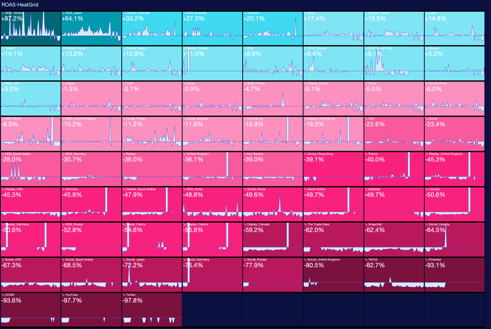
By encapsulating over 8,000 data points into a narrative-rich and visually efficient format, we not only alleviated the burden of manual data compilation but also cultivated a culture of exploration and discussion surrounding the data. The automation of this analytical view ensured the constant availability of fresh insights, encouraging informed and timely decision-making.
Conclusion: From Visualization to Value Creation
The use of Trellis charts in this context went beyond mere data visualization; it was about value creation. By presenting complex data in an accessible, insightful, and engaging manner, we helped our client see what was previously obscured. This case study is a testament to the power of thoughtful data analytics in driving strategic insights and operational efficiency. It underscores the importance of not just presenting data, but doing so in a way that invites exploration, understanding, and action.
In the ever-evolving landscape of data analytics, tools like Trellis charts are not just innovative; they are indispensable. They empower stakeholders to grasp the full spectrum of their data’s story, turning overwhelming data points into a clear path forward. As we continue to navigate the sea of data that modern business generates, it is essential to remember that the ultimate aim is to turn data into dialogue, insights into action, and challenges into opportunities.
See Sharon’s previous blog article: How I Became a Data Rock Star.