Newsletters
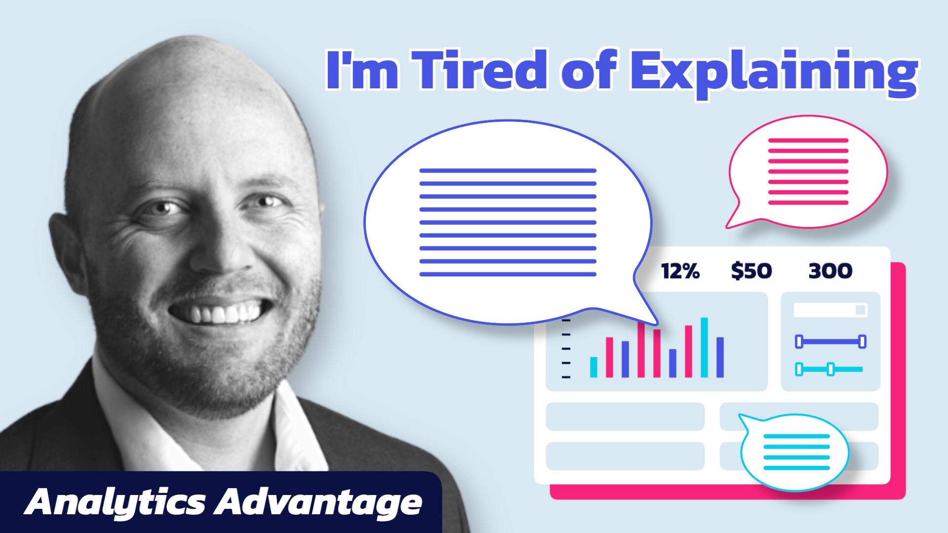
Why No One Understands Your Dashboard

Do you find yourself constantly explaining your dashboard, running endless training sessions, or writing long documentation to help users navigate it? If so, your dashboard might not be as clear as you think. A well-designed dashboard should be intuitive, self-explanatory, and easy to use—without requiring a manual or training.
In this animated Analytics Advantage newsletter, Shaun Davis explores how good design is about refinement, not complexity. Using examples from SpaceX’s Raptor engine development, Picasso’s “The Bull,” and the evolution of the iPhone vs. the Blackberry, he breaks down how removing unnecessary elements leads to better usability and greater insights.
Shaun also explains how to recognize the signs of a confusing dashboard, why data should tell a story, and how to test whether your dashboard truly works. The goal? To create dashboards that don’t just display data, but empower better decision-making.