Reviews
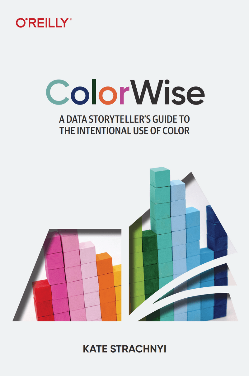
Book Review: Kate Strachnyi’s “ColorWise”

On the Struggles of a Girl’s Wardrobe, Fashion, and A Data Storyteller’s Guide to the Intentional Use of Color
Growing up, I was always terrible at fashion and pairing colors. I thought orange and black were cool colors to wear outside of Halloween, that neon-on-neon was still a trend (I blame my parents’ influence for that), and that a white necktie covered in pink hearts could be worn with almost anything.

I’m sure my mom thought I looked super cute then, but now? Too bad pictures aren’t taken in black and white, because then my mom wouldn’t have fashion blackmail material she can threaten to share with first dates. Anyways, even though I may look cute in this questionable color scheme, it definitely doesn’t make my data visualizations cute (although I tell myself that critics just don’t have my unique sense of style). But, upon my journey of becoming a young data analyst, the bad fashion choices have made their way into my dataviz dashboards, and this time, I can’t ask my fashionista sister to come to my rescue.
Mindful of these struggles, I decided to check out ColorWise: A Data Storyteller’s Guide to the Intentional Use of Color by Kate Strachyi. Through it, I learned a lot more than just picking colors that go together. In the book she talks about the historical and scientific foundations of color, how to use color in data storytelling, and how to best apply these practices in data visualizations (and in my case, improving my fashion sense).
Historical and Scientific Foundations
Strachnyi begins by tracing the historical evolution of color theory, starting with Aristotle before progressing on to Newton. Aristotle’s linkage of colors to the four earthly elements offers a glimpse into early philosophical ideas around color. Newton’s groundbreaking prism experiments laid the foundation for our modern understanding of color, experimentally demonstrating that white light comprises a spectrum of colors.
These scientific explorations detailed. in the book extend to human color perception, explaining how rods and cones in the retina translate light into signals that the brain can process. This physiological basis of color perception is important in understanding how we react to color in our daily lives (and our data visualizations). The color wheel, consisting of primary, secondary, and tertiary colors, serves as a tool for creating proper visualizations. Strachnyi’s explanation that colors can stimulate emotions and behaviors, such as red for excitement and blue for calm, underscores the psychological impact of color choices in our visual designs.

Color in Data Storytelling
Strachnyi emphasizes how data visualization is both scientific and artistic in the way it translates complex datasets into comprehensible visual forms like graphs and maps. In her chapter “Data Visualization and Data Storytelling,” she explores sequential, diverging, and categorical color schemes, and how each is suited for different types of data. For example, sequential colors (transitioning from light to dark) are ideal for ordered numerical data, while diverging colors highlight deviations from a central point.
For data visualization to be clearer to viewers, Strachnyi suggests simplifying visual elements, such as reducing a 3D bar chart to 2D, to enhance clarity. Consistency in color usage is also advised, with corresponding data points maintaining the same color across multiple graphs (so don’t try to use pink calico for multiple graphs, dear readers). The strategic use of color guides the audience through the data, making data visualization similar to storytelling.
Practical Applications and Best Practices
Strachnyi gives good practical advice on color usage in data visualization. She stresses the importance of cultural sensitivity, noting that color meanings can vary significantly across cultures. For instance, yellow signifies courage in Japan, but cowardice in the US This illustrates the need for careful color selection when expecting a global audience. Aligning color choices with industry norms ensures visualizations resonate with your audience.
Designing for inclusivity is another aspect Strachnyi covers. With 1-in-12 men and 1-in-200 women experiencing color vision deficiency, tools like Coblis Color Blindness Simulator and Color Oracle are recommended for testing color schemes. It is important to remember that red and green are very common for people who have color vision deficiency, which I talk more about in a previous blog post. Strachnyi concludes with practical examples, such as strategically using bright colors against muted backgrounds, or adjusting color schemes in temperature charts. When discussing color illusions, she cautions against potential visual misinterpretations and focuses on intentional design choices.
Strachnyi’s book is invaluable not only to data analysts but to the general public wanting to better understand the history and theory of color and how to better apply it.
For data analysts, she gives a practical guide on how to use color efficiently in data visualization and offers examples of what not to do in creating dashboards. Her book also made me realize that color is not my enemy, and that I can make better clothing decisions by being more intentional in the colors I pair together.
ColorWise has taught me how to create better, colorful dashboards, and how to compose a better wardrobe. But no color critic is ever going to convince me that my pink-hearted necktie is not a good fashion choice!