
Articles
Data Visualization Techniques: An Intern’s Notebook

Welcome to my data visualization and Tableau notebook! I thought it would be useful to share some of my notes on learning the foundations of data visualization techniques. These thoughts and discoveries are not about the mechanisms of the software itself, but rather, about learning the “how” behind creating good visualizations.
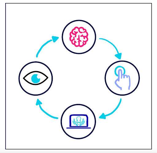
It is important to understand your audience in how their brain functions when you create visualizations. What do they observe first? What captivates their attention? How can I ensure specific details are noticed? These are good questions to ask, and these questions are answered in this notebook.
In this notebook, you will learn about Ancombe’s Quartet, preattentive attributes, leveraging color, size, and position for audience comprehension, and comprehending the brain’s visualization processing. This notebook is not only useful for beginners, but also for long term Tableau users and data visualization experts. It is crucial to remember how your audience perceives your visualizations, rather than solely focusing on designing them to suit your personal preferences.
The Importance of Foundations
- Understanding the interdisciplinary nature of data visualizations involves being familiar with certain statistical/mathematical concepts.
- It is important to see through the eyes of your audience when building dashboards.
- What is a dashboard?
- A dashboard is a visual display of data used to monitor conditions and/or facilitate understanding (source: The Big Book of Dashboards).
- This definition can be applied not only to Tableau, but to dashboards in interactive displays, PDFs, and more.
- The purpose of a dashboard is to inform an audience through the visualizations of data.
- No dashboard is perfect; all data analysts are constrained by efficiency and time.
- Where some people see perfection in a visualization, others may see the need for improvement.
- All dashboards serve to visualize ideas or numbers for your audience’s comprehension.
Ancombe’s Quartet
- The purpose of a “data viz” is to visualize data.
- It would be difficult to distinguish patterns and trends if you were to just examine lines of data.
- Groups of numbers can have similar statistical properties (such as similar means, standard deviations, and correlation coefficients).
- To understand patterns and trends of data, we want to see the data. We can use our powerful visualization system to quickly spot relationships.
- Groups of numbers can have similar statistical properties (such as similar means, standard deviations, and correlation coefficients).
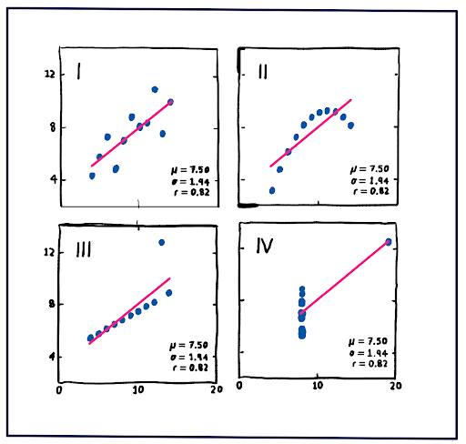
- The demonstration of this idea comes from Frank Anscombe, who in 1973 created four groups of data (x,y) called Anscombe’s Quartet.
- The groups had the same mean, regression line, and standard deviation, but visually looked different.
- Though understanding the statistical properties of groups of data is great, that information may not be enough to draw accurate conclusions from. For clarity and comprehensibility, the visualization of your data is very important.
Preattentive Attributes
- Preattentive attributes are details that our brains process subconsciously before we pay attention to those details.
- Correctly implementing preattentive attributes allows your audience to process patterns and trends quickly.
- To emphasize the most important information visually, it is important to learn how to use preattentive attributes intentionally.
Color
- Color is one of the most powerful preattentive attributes for humans, which is one of the things that makes Tableau so popular.
- Big and small color details will immediately be noticed due to our brains’ quick processing of this preattentive attribute.
- Tableau offers many different colors and color schemes to be used for this purpose.
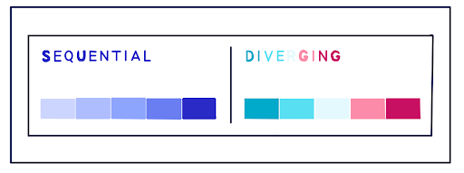
- An example of this is the sequential color scheme that uses a single color which changes from light to dark. This color scheme could be used to show rates of infection.
- Another example is the diverging color scheme, which shows two colors that diverge from the midpoint. This color scheme could be used for showing election results between two parties.
Challenges With Color
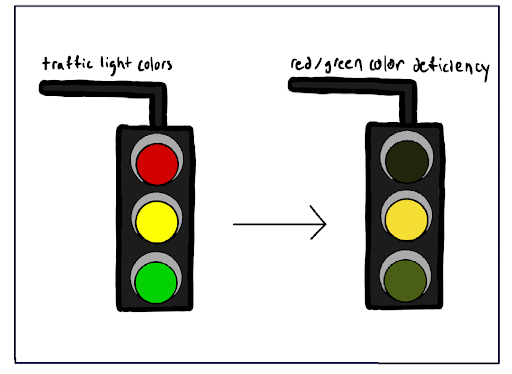
- Almost 10% of people (mostly males) have color deficiency, which can affect the way they see data visualizations which use color to communicate.
- Three types of color vision deficiency:
- red-green color blindness
- This is the most common, it makes up around 98% of color blindness.
- blue-yellow color blindness
- complete color blindness
- red-green color blindness
- People who have CVD mainly struggle with red and green colors.
- If people have trouble distinguishing red, they may have a difficult time distinguishing other colors, such as orange or purple.
- Three types of color vision deficiency:
- To use palettes that are color-blind friendly, it is best to try simulations which aid in showing how colors appear to people with CVD.
- There are many online websites and browser extensions that make color palettes for color blindness, such as Coloring for Colorblindness and Color Blindness & Color Choices.
- Almost 10% of people (mostly males) have color deficiency, which can affect the way they see data visualizations which use color to communicate.
Position
- Position is another important preattentive attribute that can be utilized to capture your audience’s attention.
- Not only can the position of graphs and objects grab the attention of the reader, but it can aid in communication of important details when other preattentive attributes aren’t successful.
- An example of this in real life is traffic lights.
- People who have CVD and can’t distinguish red, green, and yellow from each other can still read traffic lights, using position as the command instead of color.
- In traffic lights, the red light is always shown at the top of a traffic light (on vertical ones) or on the left of a traffic light (on horizontal ones).
- The same pattern follows for the other lights.
- Positioning can be leveraged to aid in swift recognition of details and trends.
- Position is another important preattentive attribute that can be utilized to capture your audience’s attention.
Size

- The size of graphs and objects can convey numerous meanings.
- Objects and graphs that are enlarged can convey a sense of importance and urgency by its size.
- Objects and graphs that are diminished can convey the message of not being as urgent, due to its reduced size.
- Remember to manipulate the sizes of the graphs based on how important they should be perceived by your audience.
- The priority graphs should be larger, the less significant graphs should be smaller, etc.
- The size of graphs and objects can convey numerous meanings.
Understanding the way your audience processes your data visualizations are important. Through the example of Anscombe’s Quartet, we see that groups of data can have identical statistical properties but visually look different, which proves the importance of visualizing your data to draw accurate analytical insights. In building data visualizations, it is important to learn how the brain processes common preattentive attributes such as color, size, and position, so you can better understand how your audience perceives your visualization. There are other preattentive attributes like movement, orientation, and grouping which can be valuable to learn. A good resource for that is here.
Ensure that you incorporate these tips into your data visualizations to enhance your audience’s understanding of the data!
See other installments of my “Intern’s Journey” series: