
Articles
Understanding Tableau: An Intern’s Journey
Our new Action intern, Autumn Kloth, continues getting settled in, learning our company culture, and furthering her education in the analytics tools we use. Here, she shares how she got started in Tableau.
Also see Part 1 of Autumn’s series, Embarking on a Career in Data Analytics: My Internship at Action.
Accessing Resources
Setting out to become proficient in Tableau has been an intriguing and challenging process for me. I began my journey by watching Tableau’s training videos.
Before anything else, you must create a Tableau account to access these videos. However, the real challenge begins once you hit Play; keeping pace with the narrator requires focus and patience. I quickly realized that the best way to tackle the learning curve here was by watching the videos first and then replicating the Tableau dashboard on my own.
Learning Tableau’s Interface
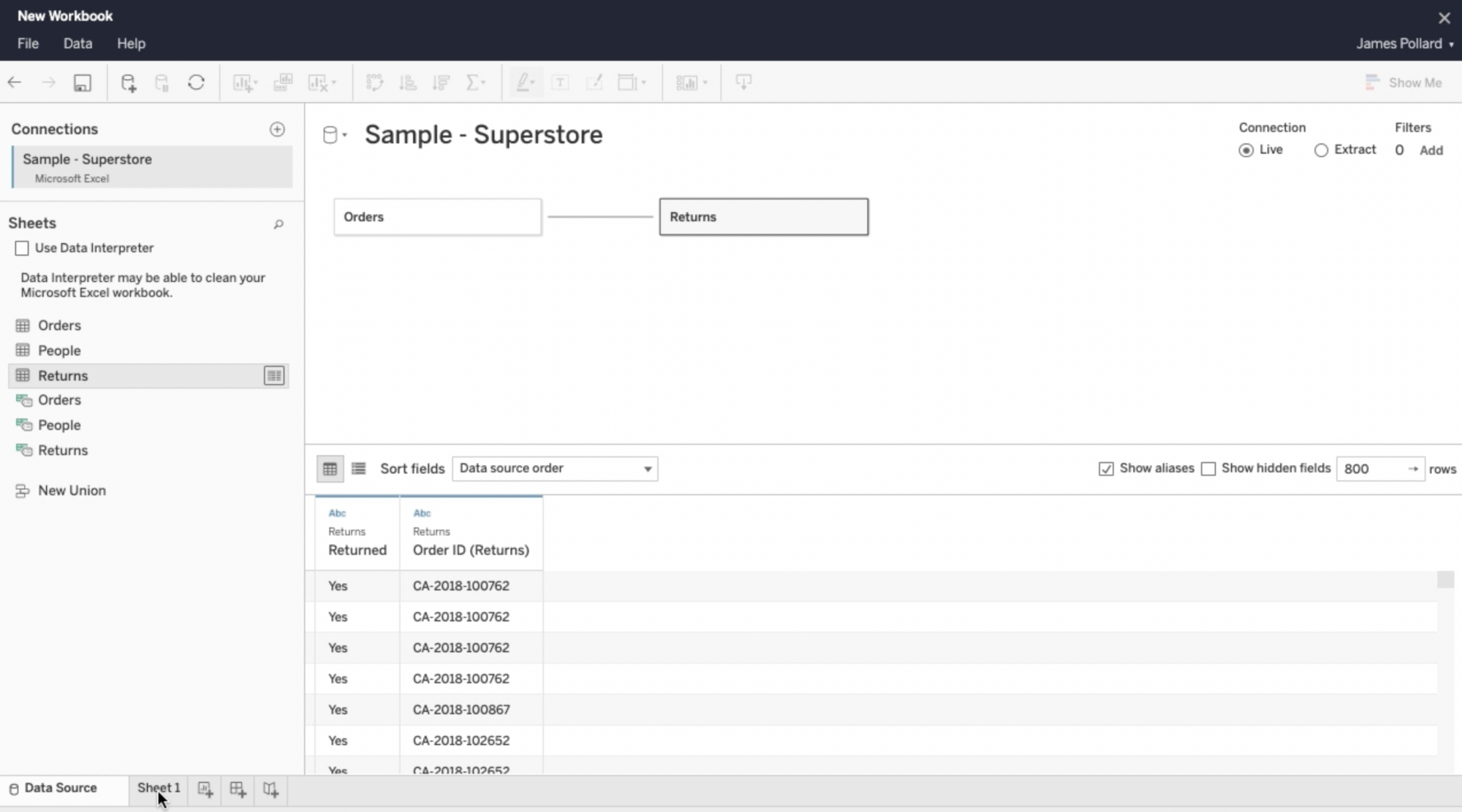
The first three videos serve as an overview, covering the basics of Tableau, how to log into the Tableau Cloud (part of your free 14-day trial), create a new workbook, and connect your data source. The Superstore dataset, provided with every copy of Tableau Desktop, is the training ground for these exercises. It’s a comprehensive dataset designed to aid in practicing workbook and dashboard creation. You must learn the process of downloading and uploading data to the Tableau Cloud, as you will frequently be performing this task.
Understanding Proper Terminology
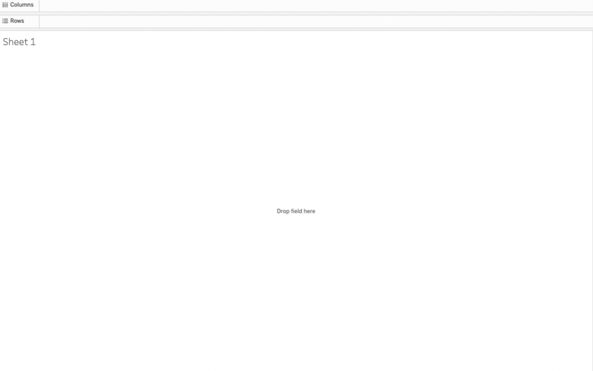
One particular video stood out to me for its focus on the proper terminology within Tableau, a crucial aspect for any beginner. Terms such as “View,” “Data Pane,” “Marks Card,” and “Toolbar” serve as the building blocks of Tableau’s interface; they are not just jargon.
The View is where visualizations come to life, with Rows and Columns shelves ready to be populated by Pills, what Tableau calls the draggable visual elements in the interface that represent a field from your dataset.
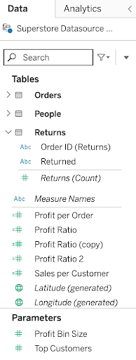
The Data Pane provides a palette of data fields from your Data Source(s), color-coded in blue and green, to distinguish between fields that are continuous and variables that are discrete. Dimensions are usually categorized as discrete variables (blue Pills) which can contain values such as geographic location, product, or date. Below the Dimensions section, Measures are usually categorized as continuous variables (green Pills) which contain variables such as Profit, Sales, or order quantity. When you drag a Measure into the view, Tableau automatically sets the aggregation of the measure, which you can change. This is typically SUM or AVERAGE, but can be set as a default for each field in the Data Pane.
The Marks Card is the artist’s tool, allowing for detailed customization of data visualizations through filters and property adjustments. Here you can drag Measure and Dimension fields to add detail and context to your data, such as changing the color, size, shape, and other properties. The Marks Card is one of the locations where you can make changes. Aggregation can be changed on shelves (Rows, Columns, Filters) and other Cards (Page, Measure Values).
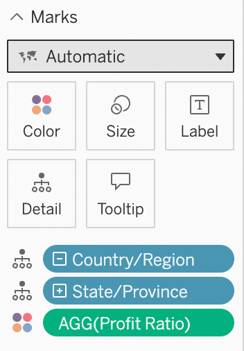
Lastly, the Toolbar offers the essential navigation and management tools needed to streamline your Tableau experience. It allows you to navigate back to Tableau’s homepage, and provides a back button, forward button, replay button, save button, add data source, pause view, create worksheet, duplicate worksheet, clear view, sort data, and more.

Practical Visualization Lessons
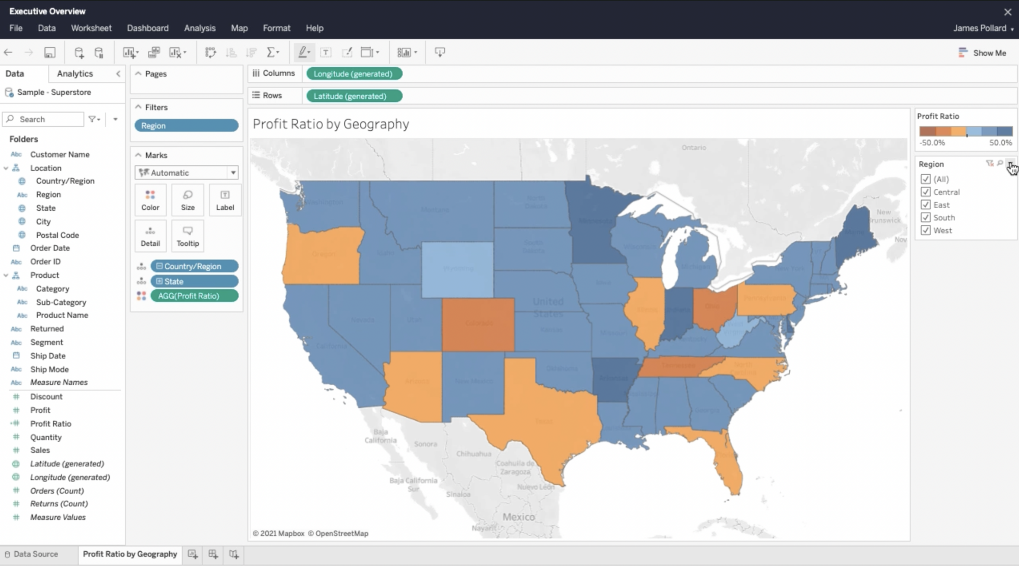
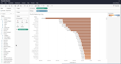
Progressing further, the Map: Profit Ratio by Geography video was a practical lesson in visualizing data geographically, focusing on the profit ratios across cities in America and Canada. This exercise sharpened my skills in creating new fields, manipulating tooltips, applying filters, and adjusting the visualization’s format and color for clarity and impact.
Facing Complexity
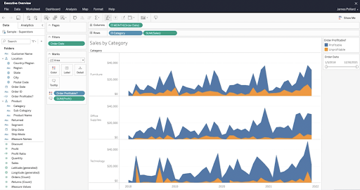
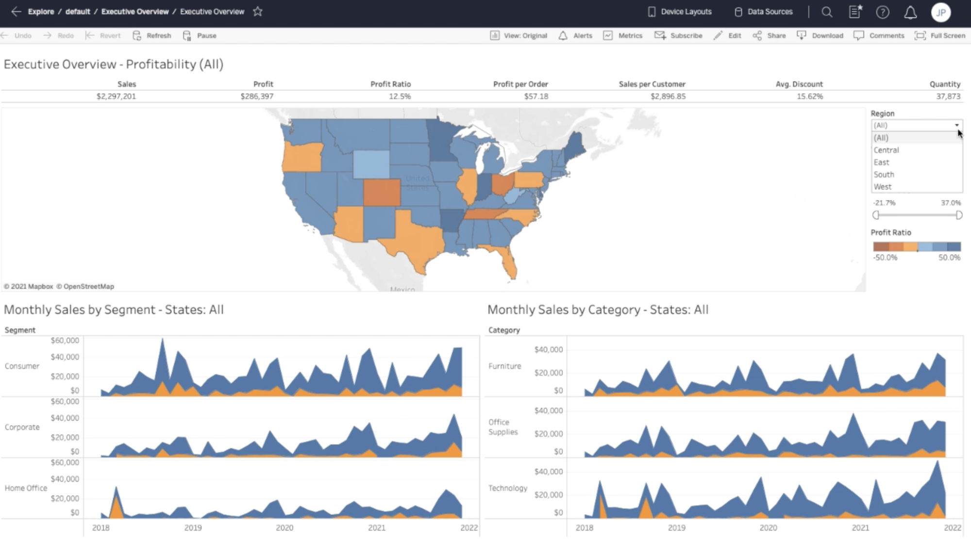
The Area Charts: Sales by Category; Sales by Segment video was a significant leap in complexity, introducing the challenge of creating multiple area charts. My goal was to analyze Sales performance across different Categories (Furniture, Office Supplies, and Technology) and Segments (Consumer, Corporate, Home Office) over time, employing a calculated Level of Detail (LOD) expression to more deeply investigate Profitability. This video was a test of patience and skill, particularly in understanding LOD expressions and integrating these insights into other visualizations like the Map: Profit Ratio by Geography.
Learning Concise Techniques
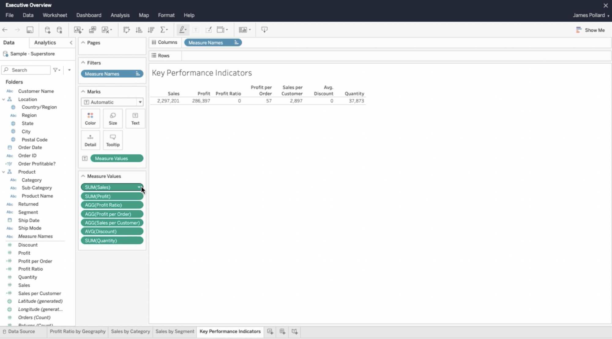
Continuing my explorations, the Text Table: Key Performance Indicators video focused on presenting a series of Measure Values in a table. This was a lesson in the subtleties of data aggregation and formatting, crucial for conveying key performance indicators (KPIs) effectively.
Challenging Concepts and Techniques
This post would not be complete without mentioning the challenges and continued learning introduced in subsequent videos, such as editing worksheet titles, sorting data, customizing color and labels in bar charts, and the detailed process of connecting graphs using Viz In Tooltips. Viz In Tooltips are embedded visualizations inside your view that can reveal more details about the data to your audience. Though tooltips can be difficult to learn, they are great for providing in-depth information about certain values in the view area.
Bringing it All Home
The Creating Dashboards video encapsulated the culmination of these skills, emphasizing the strategic use of objects to manipulate the size and layout of graphs and sheets, along with using advanced filter settings to enhance dashboard interactivity and usability.
Reflection
My journey through Tableau’s learning resources was more than just consuming a series of training videos; it was a transformative experience that equipped me with the knowledge and skills to more effectively navigate the complexities in creating compelling visualizations. From the foundational concepts to the deeper techniques, each step brought new challenges and insights, underscoring the importance of patience, practice, and perseverance in more fully understanding Tableau.
Recommendation
I recommend that others learning Tableau first watch the training videos, take notes, and then follow along with the instructor to create their own dashboard. The notes will become very useful in the future when you come across certain questions/obstacles in your creations.
For anyone setting out on a similar course, remember: the path to expertise is an ongoing process of continuous learning and exploration.
I’m excited to create informative dashboards and become more skilled at data viz through Tableau! If you would like to see more of my journey, follow me on Tableau Public.
I hope you’ll also read Part 3 of “My Intern’s Journey” series, Data Visualization Techniques: An Intern’s Notebook.