

Artificial Intelligence
A KPI Dashboard Gets an Agentic AI Makeover

I asked Claude Code to make over my signature KPI dashboard concept using World Development Indicators data. The results were beautiful, and Claude invented a new visualization type along the way.
The Core Problem
How do we monitor dozens of KPIs in a simple, easy-to-read format? One solution is a dashboard concept I created which is described in Chapter 8 of The Big Book of Dashboards. The dashboard, shown below, has a simple layout with the name of each metric, its current value, status vs. a target, and a corresponding trend line. Combine that with vertical scrolling, a few filters, and some cleverness in the data structure, and you get a flexible tool that is easy to understand and maintain.
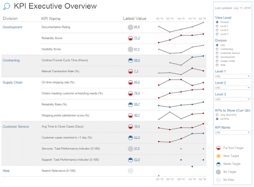
In the years since the original publication and promotion of that idea, I’ve wondered how it could be improved. Could it break free of the limitations imposed by Tableau with a web-native codebase? What if I used real-world data instead of randomly generated rows and columns associated with a fake company?
A few vibe-coding sessions with the World Development Indicators data (published by the World Bank) led me down a very promising path, and eventually to the result you see below. Take a pause, try out the live dashboard, then come back here to read about what’s under the hood.
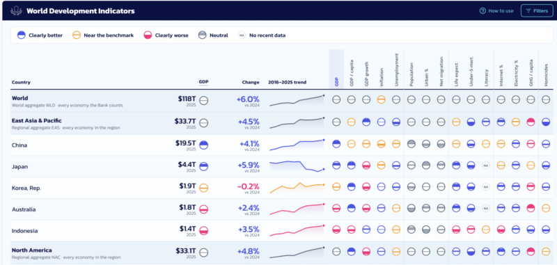
Click here to explore the live World Development Indicators dashboard
#MakeoverMonday, with AI
Data visualization enthusiasts, especially those in the Tableau community, are likely familiar with the #MakeoverMonday project. Every week, an article is posted along with a dataset and an invitation to make a new visualization for the sake of community learning and personal development. I decided to apply that idea to my previous work and invite an agent, Claude Opus 5, to convert my source concept into a web-based dashboard.
The early instructions I gave it were simple and broad in scope:
- Rebuild the Multiple Key Performance Metrics dashboard as a code-based web app.
- Use World Development Indicators as the source data<./li>
- Narrow it down to the most-discussed metrics from a list of hundreds of measurements in multiple topic categories.
- Pull the data directly from the World Bank website, and build a monthly refresh process.
- Preserve the core technique from my Tableau version: show current value, compare to a target with a glyph and label, and color the trend line relative to targets.
- Infer and define favorable directions and targets for each metric.
- Match our company’s defined brand styles for the color palette, typeface, sizes, etc.
- Make it fast and free to host with a static build deployable on GitHub Pages, serverless.
For those who might care about the exact prompt, here it is (with the caveat that this was highly iterative, not a one-shot solution):
I built this dashboard which went viral and later became a chapter in the Big Book of Dashboards. I want to create a similar one that’s web-based and easily deployed on GitHub.
The basic idea is that companies have a lot of KPIs they want to put together in one place. But, things are measured differently. Some are percentages, dollars, or raw numbers. Some numbers are tiny decimals and others are millions or billions. I’ve developed solutions that are practical and widely valued by my clients. I’ve discussed many of the concepts in these videos.
What I want is to use world development indicators as the raw source demonstrating these concepts. It should be limited to the most interesting set of country metrics. Examples would be GDP, population, life expectancy, literacy, and generally things you might see in the news. Pick about a dozen.
The files in the context folder show the data structure I’ve developed for Tableau. I want something similarly consolidated and flexible, however, it seems better to get real-time data from the World Bank API instead. I’d check the speed of that and decide if it should be live or statically built on some routine.
For the core analysis, show the most recent value for perhaps the top 20 countries (grouped by regions) and how it has changed from the previous measurement (up/down arrows). Show 5-10 year trends. Include a filter menu to change the list of countries, choose to view by region or country detail, and choose other metrics. Tooltips should show metric definitions and caveats on hover.
Finally, the visual aspect of this web dashboard should be nothing short of stunning. Follow the Action Brand Book and draw from visual concepts in the example published in the BBOD chapter. Make sure the text is large and readable: no fine print like default AI fonts often are.
Do this in an agentic way with a full plan, to-do tracker, and specific checkpoints so it can be restarted if token limits are reached or anything is interrupted for any reason.
I’ll give a special shout-out to anyone who inspects the commit log on GitHub to study how the whole process played out.
Big Improvements
Compared to the original, this dashboard has too many improvements to fully describe in this article. These are the ones that stand out the most.
- More compact: Metrics are shown in columns with status indicators instead of adding a new row for each one.
- Easy to scan: The grid design simplifies comparisons of many metrics across countries.
- Polished UI: Every detail is meticulously tuned, breaking free of constraints inherent in BI software. My favorite thing was spending more time on perfecting the details because the undercarriage was so much easier to do with AI.
- Intro tutorial: It was possible before, but clunky. This one meets modern conventions and expectations for first-time user orientation.
- Blazing fast performance: No BI tool can compete with static HTML in a browser. No one will ever complain about load times. Delays completely disappear.
- Deep sourcing: Every metric has a clear definition and link back to the source of truth. There’s no need for a data catalog or separate documentation. Everything is a hover or click away.
- Simple data updating: Extracting, transforming, and loading data used to be a heavy and thankless task with standalone tools or difficult code. This one runs with GitHub actions as part of a self-contained repository. There are no special tools and fewer failure points or dependencies.
- Filter memory: Every selection is reflected in the URL, making it easy to share a specific view with a simple click on the link icon or by copying the browser address bar.
A New Viz Type: The Bucket Ball
The original dashboard featured an uncommon yet effective set of circular icons available in the “Ratings” shapes that ship along with Tableau Desktop, shown below. The set includes circles filled at the top half, bottom half, fully filled, and empty. Colors can then be controlled to encode “good” or “bad” comparisons.
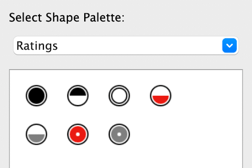
I built the example visualization with this predefined set of icons. Claude took that input and broke free of those limitations. It developed functions to fill the area above or below the midline in proportion to the data. So, instead of “above” or “below,” it can display “90% above” or “50% below” and anything in between.
The surprising part is that I did not ask it to do that. It just decided that would be the best way to represent a metric relative to its target based on my examples. I didn’t think of it myself, but after seeing it, I loved the idea. It reminded me of a game my kids invented with their in-laws called “bucket ball.” This viz type either fills or empties a circular “bucket” according to each measurement.
Left to its own sophisticated model, Claude didn’t get everything perfect. I double-checked every logical function and visual encoding to ensure the reader would not be confused or accidentally misled. I found some flaws and worked with the agent to refine the details based on my experience and training, much the same way I would collaborate with a colleague or client in a quality assurance process.
Expert Human Refinements
The first and most fundamental mistake the agent made was in the comparison with a benchmark. The easy assumption would be to use a median value of the countries a user selects, so that’s the calculation it wrote. The correct number, however, would be the curated regional aggregates found in the source data.
A similar error is that the model output decided to calculate regional subtotals based on details from member countries instead of displaying the published aggregates. Decades worth of organizational learning has been applied to calculating those published numbers. Those are nuances we can’t ignore if we want readers to trust the dashboard’s displayed conclusions.
Other refinements included presentation choices and visual miscues that a coding agent is unlikely to catch, such as:
- “Worse” icons were always filled below the center line, regardless of logical directionality. Where homicides were above the benchmark, the circle filled below. Correction: Fill above the midline and retain the color indicating “bad.”
- Line and dot colors didn’t match. The output coded dots to show year-over-year change while the lines were colored to indicate variance from the benchmark.
- Calculation corrections were not applied throughout the code. After switching variance calculations from calculated values to published data, icon color and icon fill didn’t make sense. One icon had GDP above the regional total, another below, and they were both the same color. The earlier chat fixed the fill but not the color logic.
- Instructions were too verbose. Users don’t want to read a paragraph to understand things like “Hover for metric details.”
Everything else could be described as polishing visual and interactive details. Those don’t materially change the analysis but go a long way toward minimizing distracting elements and giving the audience a professionally tailored product.
World Data, Shared with the World
The finished dashboard is live at robertrouse.github and the code is hosted here: wdi-dashboard. Data is refreshed from the World Bank source on the first day of every month.
The result is something I could not have built in any available BI tool, not because I lack the skills or the tools lack the capabilities, but because I would not have found enough time to perform the software gymnastics necessary to produce these views and associated data refreshing infrastructure.
In the spirit of the long-running #MakeoverMonday project, critical and constructive feedback for mutual learning is welcome and encouraged!